Wednesday, March 13, 2013

Cover Reveal: CLICKS by Amy Evans!


Hi, sweet readers!

I'm so very very very excited to be part of the team hosting a cover reveal for my Inkslinger PR sister, Amy Evans.

And hey - the cover is awesome, but I can pretty much guarantee that you'll be ready to read the book, cover or not, after this description. Because - LOOK:


ABOUT CLICKS:

Born and bred to win, Cami’s family expects her to join a secret society called The Guard, marry one of the two identical twin boys next door, and stay on Pinhold Island for the rest of her life. Home to perfect waves, black sand beaches, and the world-famous Surf Carnival, Pinhold seems deceptively perfect. While visitors are jealous of the few hundred people who get to live there, Cami feels stifled. Thanks to the intense link she shares with her own twin, Mica, she can't even be alone with her thoughts. While Cami's more than happy to be a lifeguard, a lifelong commitment to the endless summer feels like a trap. For mainlanders, success in the Surf Carnival means a place to live on Island constant access to the huge, perfect waves that crash just off shore.  Cami sees it as a way out til a seemingly small injury turns her world upside down and prevents her from the first competition.

Descendants of the ten families who originally settled on the Island, Cami and Mica are part of a new generation, the most perfect example of what nature and time can create. This summer was their time to prove that the years of training have paid off, but it's not going as planned. It's suddenly impossible for Cami to resist the magnetic attraction between her and Blake, one of the twins next door.  Just as the Surf Carnival competition starts to heat up, the best swimmers start going down. Something is pulling them to the ocean floor where they wind up in comas and can't be woken up.  When Mica goes down too, Cami can no longer wait for those in charge to figure out how to help him.

With her twin link silenced, the clicks that she used to get from her brother start coming from somewhere else. Can she trust her instincts and learn to listen in enough time to save her friends, or will she lose them along with the island home that she loves?
AWESOME, right???
Okay. I know you want to see the pretty pretty haunting hopeful cover! 
But gosh, it's SO PRETTY....I kind of want to keep it to myself....
And it's my blog, so I can do what I want....
But I did promise KP, and Amy, so......
.....
Well.....
Okay. Here it is!!!!

You know you want to....


ABOUT AMY EVANS:

Amy Evans is a writer, game producer and interactive technology evangelist with fifteen years of experience. In 2000, she co-founded HIPnTASTY Inc., a mobile marketing and entertainment company known for creating content that merges communication and entertainment, using technology to connect users with stories, devices, and the world at large.

Amy has designed and launched many transmedia and mobile applications including Mobile Hunt, a location based scavenger hunt that took place  in twelve cities for Lollapalooza, Name That Ringtone with BMI Music and Ringtone Trivia for Rogers AT&T.

In addition to designing content, Amy served the company as President, licensing HIPnTASTY technology to  clients and partners including Marvel, Verizon, Ericsson,gurl.com, to name a few. As an early evangelist of mobile marketing, she consulted with a number of advertising agencies including McCannErickson, Footsteps Inc and J. Walter Thompson to help their brands break into the mobile marketing space.

As executive Producer for Immersedition, Amy is responsible for licensing technology, creative development and product launches.

Her first young adult novel, Clicks, will be released in May 2013.


Stalk Follow Amy!


Friday, March 8, 2013

Publishing 101 - Getting a Great Cover

 Hi sweet readers! I thought I'd do a series of posts detailing my experiences taking Publishing 101 via publication of my debut novel.

My goal is to publish a book that is indistinguishable to my readers from any novel from a Big Five publisher.  It can be done - in fact, finding such a novel is the one thing that finally got me off my butt and pushed me to self-publish ONE.

Just as a traditionally published book has a huge team of professionals behind it, ONE does as well. My plan is to blog about every step of the process from agent-approved manuscript to published book. 


Your book's cover is one of the most important things for making sure it reaches the maximum amount of readers.

I know we say that people shouldn't judge books by their covers, but that's ridiculous. Your book's cover is the outward representation of what's inside. If you didn't invest creativity, care, and professionalism into your cover's design, how do you expect your readers to think you did anything differently with the words and story inside?

I had mad cover envy for Trisha Leigh's covers for her The Last Year series, and when she told me her cover designer, Nathalia Suellen, was a freelance cover artist and open to clients, I emailed right away to reserve my spot. I contracted her for both ONE and TWO right then.

First, she asked me to tell her a bit about the book and give me a description of the main character, if I wanted her on the cover. So I sent her this blurb and the photo I had worked off of when describing Merrin, the main character, in the book:


Senior Portraits

Then she shot back a few basic questions: 

Do you want the girl on the first book and the boy on the second? Or the same girl in both? (you guys will see the answer to that when we reveal TWO's cover.)

Whats your favorite color? (I told her sunset colors were important.)

Is there any important element like an animal or a special necklace? (no, but flight and the sky are big parts of the story and theme.)


I also sent her this image I had found and loved on Flickr: 

(Shot by Lauren Withrow found here.)
Then, she got to work finding cover models. She sent me a bunch of options and asked me to pick my favorites:

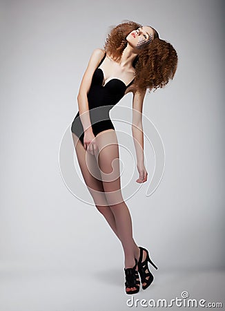
Pretty Supermodel Redhead Woman - Sexiness Royalty Free Stock Image - Image: 25386166
NO. 
The dancer in midair on black Royalty Free Stock Photo
Beautiful, but it doesn't look like Mer, body, face, hair, or outfit. 

Young girl up in air against blue sky Royalty Free Stock Photo
Gorgeous, but not the right mood. And Mer would never wear that.

girl in dress jumps on green lawn Royalty Free Stock Photo
Cute, but I wanted to see her head. And I hated the shoes.

Young woman flying up Royalty Free Stock Photo
Ohhhh. Now we're getting somewhere. But her eyes are freaky and her hair's wrong.
Departs Royalty Free Stock Photo
Her face and hair are perfect, even though her hair's the wrong color. But that outfit? Really?
And the BRIGHTNESS. *wince* 


No problem, Nathalia said.
We can use a different head and body, and change hair colors. See?

(ZOMG NATHALIA IS A GENIUS) 

Okay. So then she sent me an idea sketch.


She wanted this skeleton underlaid to show that the characters were a little more than human, and the birds. She really wanted birds. 

(I did not want the birds, but she really did. And since she's a genius, I let her try them.)

But the skeleton idea kept freaking me out, so I sent her this instead. What if we tried underlaying THIS on their skin?
people molecular structure Royalty Free Stock Vector Art Illustration

Nathalia didn't love that for under the skin, but she DID like it. A lot. And promised me she would use it. 

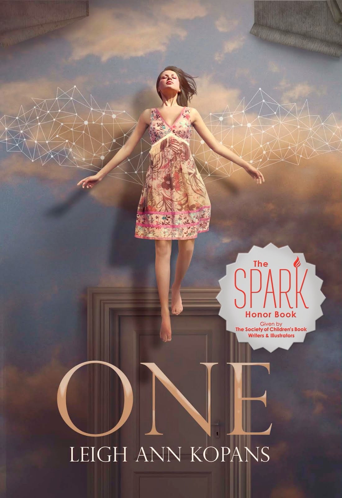
About a month later, I got this back:

 She's a master of symbolism, and it shows. Can you believe that just from that blurb, she was able to come up with an image that was a girl floating against the sky, except the sky isn't really the sky, it's really wallpaper because she's TRAPPED INSIDE HER OWN BODY??? Come on! Genius.
Also!  Pretty. Except...I still hated the birds. And while I loved the connect-the-dots, constellation, DNA-whatever-it-is, the wings just didn't fit. Merrin never had wings, and never really thought about it.
So I told Nathalia to take both out.

BUT then we just had this. BORING. 

So she put the dots back in, but in a totally different way.  They're kind of like wings, but not really, they could be like a current or something or just imaginary or WHATEVER THEY ARE PRETTY. 
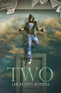
Et voila! Here is the cover we ended up with....
GORGEOUSSSSSSNESSSSSSS

Now, Nathalia is nothing if not a perfectionist. So even after I told her I loved the cover, she kept coming up with new versions....
Meh.
Mehhhhhhh.


I still loved that last one I posted and the one I ultimately used, so
that's what we went with! Yay!!!

Now. I want to say something about this whole cover business.

I'm not normally a self-pub evangelist. I mean, I try to shut up about how much I love being a self-publishing author, and how great it is.

But when it comes to the cover? I cannot. I just can't shut up about how extremely, incredibly, unregrettably DELIGHTED I am that I had complete control, both inspiration and veto-power wise, over this cover.

As I said waaaay up above, your cover is the often the only factor potential readers use to decide whether or not to pick up your book. It's so, so, so important, you guys. And if I wasn't self publishing, I most likely would not have had the fine-tuning control over this most important of book aspects that I had.

So. Basically, this cover business is one of the things that most makes me love, love, LOVE my decision to self-publish ONE. And a HUGE "thank you" is due to Nathalia, for being so patient with me through the whole process, and, of course, creating a GENIUS cover. Genius genius. 

Monday, March 4, 2013

Publishing 101 - Copyedits


Hi sweet readers! I thought I'd do a series of posts detailing my experiences taking Publishing 101 via publication of my debut novel.

My goal is to publish a book that is indistinguishable to my readers from any novel from a Big Five publisher.  It can be done - in fact, finding such a novel is the one thing that finally got me off my butt and pushed me to self-publish ONE.

Just as a traditionally published book has a huge team of professionals behind it, ONE does as well. My plan is to blog about every step of the process from agent-approved manuscript to published book. 


So. It's pretty shocking how few rules of grammar I know.

I'm not kidding.  I mean, this manuscript went through three revisions, got polished up to send to editors in big publishing houses, went through intense line edits with Jamie. I was all confident in its perfection when I sent it to my fabulous copyeditor Becca Weston.

This'll be no problem for her, I thought. She'll have it done in no time, because it's so close to perfect. 

HAHAHAHAHAHAHAHAHAHAHAHAHAHA

I was hilarious.

Every page was FILLED with the red of the track-changes path. Seriously. Once there was like half a page with no corrections and I did a little victory dance in my chair.

Here are some of the grammar and formatting issues that were running rampant through my perfectly shiny and polished manuscript before I sent it to my copyeditor:

  • Endash vs. Emdash (I didn't even know there was a difference. Truth.)
  • lie vs. lay vs. laid (No, I don't really know the difference between all of them. No, I don't think it makes me a bad writer.)
  • When to spell out numbers and when to use numerals (Pretty sure I missed this in high school.)
  • Caps vs. Italics vs. Caps AND Italics (When it comes to titles and names of buildings? I'm lost on this stuff.)
  • who vs. that (At the beginning of a clause. Don't tell me you know without a doubt when one is right.)


Not to mention, she had even MORE line editing suggestions that made the MS even shinier! In addition to eliminating a bunch of run-on sentences and cutting down significantly on the sentences that I had started with "Then," or "And then," she cleaned up a TON. Check it out:

Before:
"The sound of a metal stools’ legs scraping against the floor makes me cringe. I whip my head around and that blond boy from the hallway scoots his stool a little closer to my desk.
 Well, ‘boy’ isn’t an accurate term. It’s even clearer now, without the hustle and confusion of the hallway, and with him sitting right next to me, that he’s a giant."


After: 
The sound of metal legs scraping against the floor makes me cringe. I whip my head around, and that blond boy from the hallway scoots his stool a little closer to my desk.
 Well, “boy” isn’t an accurate term. It’s even clearer now — with him sitting right next to me outside of the hustle and confusion of the hallway — that he’s a giant.


Here's one where Becks eliminated a weird repetition of words (which, duh, how did I NOT think of this:)

Before: 
I sit there, gnawing on the candy and pretending I don’t notice Mom raising her eyes from the feed. Her eyes are sad. 

After:
I sit there, gnawing on the candy and pretending I don’t notice Mom raising her eyes from the feed. She looks sad. 

There was also some plain-old ridiculousness in there. 

  • ONE takes place in the near future, but Becks found references to boom boxes AND drive-in movies in there. Yeesh. 
  • Elias's house - I described a route for the two of them to take through the halls and rooms that didn't accord with a previous description. Rebecca seemed to have a map of the house in her head, and corrected me. 
  • Anatomical impossibilities - I don't know why I described Merrin standing this one way I did, but it was literally not possible if she has a normal human anatomy. Which she does.

 One last thing:  I have a confession. I hadn't read ONE all the way through for a long time until I went through to approve each of Beck's copyedits.  It was a good thing I had to, because I fell in love with my characters and story all over again.

To make a long story short, if you are indie publishing, hire a copyeditor. This second round of close edits is super indispensable - even if you think your MS is as shiny as possible already. 

LinkWithin